
Illustrating history
My neighbor and I walk our dogs together. One day, she invited us inside for some hot tea on a rainy day. When I was there, I noticed this antique photo on her wall.
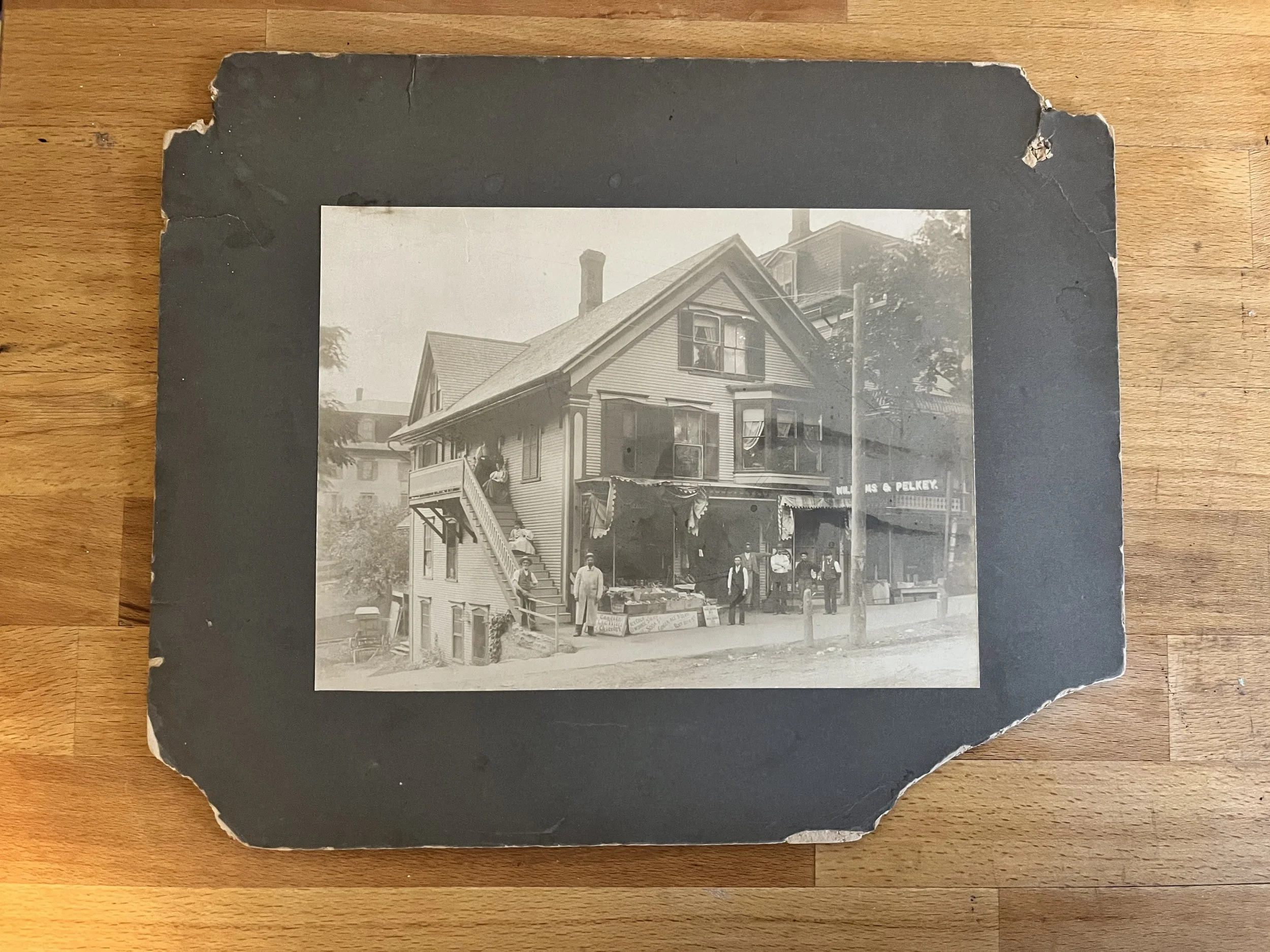
My neighbor’s antique photo, mounted to crumbling matboard.
I mentioned that I specialize in creating home portraits, and that I love working from old photographs. I offered to scan the image, restore the photo digitally, and create a home portrait for her in my usual ink and watercolor style. This would also provide an opportunity to re-imagine the colors of the scene.
A photo, restored.
My first step was to scan the photo at high resolution. I use an Epson Workforce Pro scanner and printer, which I love for (1) the water-resistant ink, and (2) the wonderful scan quality for watercolor. I scanned it as a PNG file at 400 dpi resolution. I uploaded that file into Photoshop, and got to work.
I won’t get into all the boring details of the photo restoration process here, just know that there are folks who specialize in this sort of thing! I know just enough to remove watermarks, reflections, noise, and bump up detail and contrast. Here is the result.

The antique 19th-century photo, scanned and restored in Photoshop.
Creating the illustration
The real fun of this project was creating the illustration from the photo. My neighbor wanted to include the building, signage, and grocery, but not the people standing in front and on the steps. This called for a little creativity.
My usual process for creating a home portrait from an old photo is to clean it up digitally, upload the edited image to Procreate on my iPad Pro, then use my Apple Pencil to create the line drawing. In this case, I had an opportunity to zoom in on the signage, and even the odd details like the mysterious barrel in front of the building next door. Here is my linework drawing:

My linework sketch of the old house, hand-drawn in Procreate on iPad Pro with Apple Pencil.
Painting with imagination… and a furry friend.
Once my linework drawing was complete, I printed it on 100% cotton hot press watercolor paper. I prefer the Blick brand for these types of projects, because the paper works well in my printer, and stands up to multiple coats of watercolor paint without warping. I feed the watercolor paper into my Epson Workforce Pro and print with Epson Dura Brite ink. This ink is very water resistant, if I allow the ink to dry for several hours before adding water and paint.
While I painted, I worked on training my dog, Milo, to lay on a tiny cot next to my art table. Here is me painting and feeding him treats as I go.
Since there are no colors in the original photo, I had to guess what color the house, awning, and shutters would be. I did one version with brown shutters and a green and white awning. While this is a historically accurate color scheme, it looked terrible as an illustration! This is the beauty of having digital line work - I just printed another copy and started the painting process over.
Here is a photo of my original painting (upper left) and the new painting (lower right), which I like much better.

I liked this house so much, I painted it twice!
The final illustration
I made some stylistic choices along the way, which help draw the eye into the details of the scene which were hard to see in the original photo. For example:
I left the “Williams & Pelkey” sign white to help it stand out. In the original photo, the sign has white letters on a dark background.
I brightened the blue glass insulators on top of the (presumably new at the time) telephone pole, and added a teeny bit of blue iridescent Fintec watercolor. I collect these insulators so I couldn’t help it!
There was a bunch of bananas (or what appeared to be bananas) in one of the baskets at the green grocery market. So I recolored those, and they are the one and only yellow item in the illustration. Yellow is a bossy and bold color; a little goes a long way.
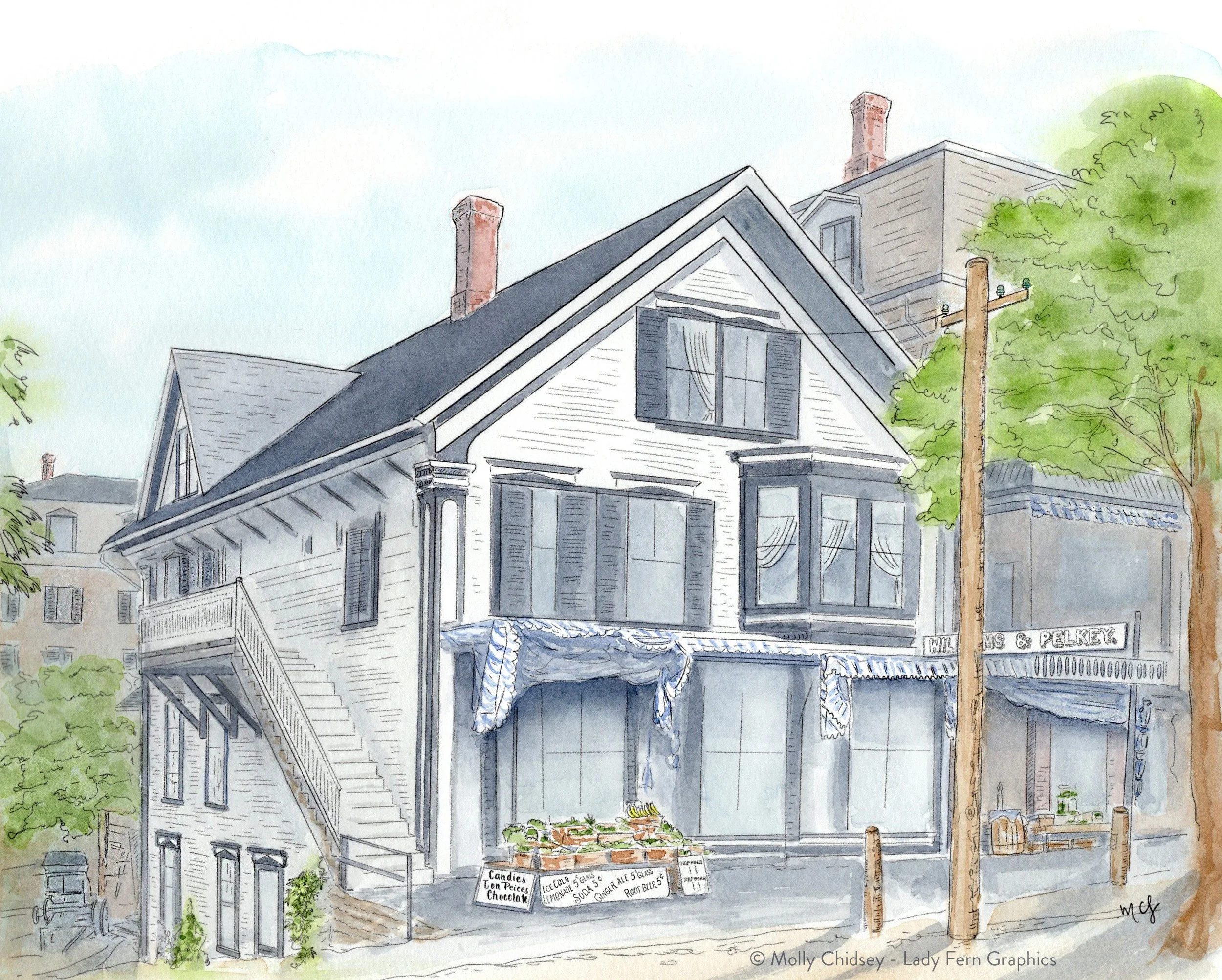
My final illustration, recolored to how I imagine it could have looked at the time.
📷 Do you have a photo of a historic building that is special to you?
Let me help you bring it to life. Contact me for an estimate for your architectural portrait today.
End note: I feel it’s important to recognize that the time period featured in this photo was not an equitable or peaceful time for people of color and women. As much as I admire architectural heritage and design, I do not aim to glorify that time in American history with nostalgia.
Do you like reading Behind the Scenes?
Subscribe for free! Get a glimpse inside my creative process, free art tutorials, and sneak previews from my illustration studio in Portland, Oregon.